Thumbnail

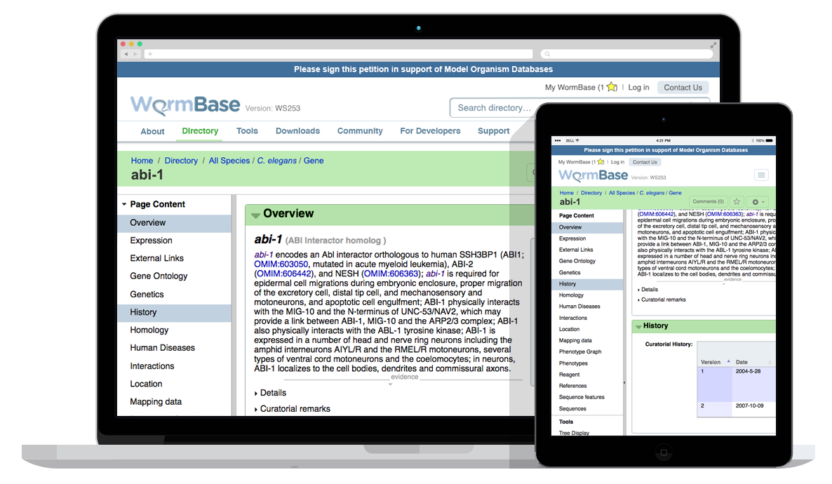
WormBase Website

URL: www.wormbase.org

* NOTE: Screen mockups shown may be different from what is currently live on the web.

Summary:

  • The stakeholders wanted feedback around the usability and UX of the website, namely around the menu and other navigational elements, as well as the search features of the website.
  • In order to make specific and objective recommendations, an in-depth analysis of the current website’s user experience was required. This allowed us to understand who visits the website, why users visit the website, and how the website was (and wasn’t) meeting user goals.
  • Stakeholders were distributed across North America and Europe so design discussions were held mostly online.

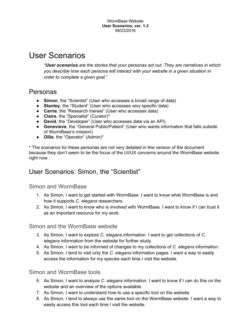
Sample personaSample user scenariosSitemap, current

Menu and Navigational Elements

Summary:

  • The most common feedback from website users was that they had difficulty finding what they were looking for. This seemed to be related to the menu and other navigational elements of the website.
  • Both changes to site organization and UI were proposed to address this issue.

ScreenshotScreenshotScreenshotScreenshotScreenshotScreenshot

Search Features

Summary:

  • Another common feedback was that the website’s search features were difficult to use. The stakeholders also felt that users weren’t leveraging the website’s search features to their full potential.
  • Again, both changes to site organization and UI were proposed to address these issues.

Sitemap, new

ScreenshotScreenshotScreenshotScreenshotScreenshotScreenshotScreenshotScreenshot

Thumbnail

Ontario Tumour Bank Website

URL: ontariotumourbank.ca

* NOTE: Screen mockups shown may be different from what is currently live on the web.

Summary:

  • The stakeholders wanted to re-establish themselves as a program independent of the institution that hosts them. Up until then, the stakeholders had no unique branding and their web presence was a sub-section of the host institution’s website.
  • The most common feedback from users of their existing web presence was that they had difficulty finding what they were looking for. The stakeholders wanted this to be improved on the new website.
  • The stakeholders also wanted the website to encourage users to use the program’s other services, as well as attract new groups of users.
  • Personas and user scenarios were developed based on the stakeholders’ current web presence and project requirements. These were then used to propose a sitemap and web page layouts that would better meet user needs, both existing and new.
  • Branding for the stakeholders was developed separately from the website, and this in turn was used to develop the look and feel of the website.

ScreenshotScreenshotScreenshotScreenshot

Thumbnail

bioinformatics.ca

URL: bioinformatics.ca

* NOTE: Screen mockups shown may be different from what is currently live on the web.

Summary:

  • As part of a redesign of their website, the stakeholders wanted to emphasize that bioinformatics.ca was more than just the Canadian Bioinformatics Workshops series, and encourage users to access the other features of the website. They also wanted to draw more attention to the fact that past course material was available on the website for free.
  • Personas and user scenarios were developed based on the stakeholders’ current site and project requirements. These were then used to propose a sitemap and webpage layouts that would better meet user needs.

ScreenshotScreenshotScreenshotScreenshot

Mobile Views

Summary:

  • The website had initially been developed as desktop-only and there was request to make the website also accessible on mobile devices.

iPhone screenshots

Canadian Bioinformatics Workshops Registration

Summary:

  • Users registering for workshops were being taken to a 3rd party website, but they were most likely not expecting this to happen. There needed to be a way to visually tie content on the website to that on the 3rd party website so that the transition between the 2 websites didn’t disorient the user.

ScreenshotEmail screenshot